CSS3+jQuery实现菜单点击波纹涟漪效果
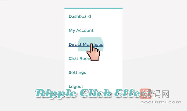
这是一个是点击时波纹涟漪特效的代码,一个圆圈元素从用户点击的位置径向扩散开来。大概原理是在单击“坐标”后面的“父项”与“父项”的链接后面创建一个圆圈元素(隐藏的)。最初是按比例缩小到0%,然后动画到250%,以覆盖整个父元素。随着圆圈的增加,其透明度开始下降。
HTML
<h1>Ripple Click Effect</h1>
<ul>
	<li><a>Dashboard</a></li>
	<li><a>My Account</a></li>
	<li><a>Direct Messages</a></li>
	<li><a>Chat Rooms</a></li>
	<li><a>Settings</a></li>
	<li><a>Logout</a></li>
</ul>
CSS
/*custom fonts - Bitter, Montserrat*/
@import url('http://fonts.useso.com/css?family=Montserrat|Bitter');
h1 {
	font: normal 32px/32px Bitter; color: white;
	text-align: center; padding: 85px 100px;
}

/*nav styles*/
ul {
	background: white; border-top: 6px solid hsl(180, 40%, 60%);
	width: 200px; margin: 0 auto;
}
ul li {
	list-style-type: none;
	/*relative positioning for list items along with overflow hidden to contain the overflowing ripple*/
	position: relative;
	overflow: hidden;
}
ul li a {
	font: normal 14px/28px Montserrat; color: hsl(180, 40%, 40%);
	display: block; padding: 10px 15px;
	text-decoration: none;
	cursor: pointer; /*since the links are dummy without href values*/
	/*prevent text selection*/
	user-select: none;
	/*static positioned elements appear behind absolutely positioned siblings(.ink in this case) hence we will make the links relatively positioned to bring them above .ink*/
	position: relative;
}

/*.ink styles - the elements which will create the ripple effect. The size and position of these elements will be set by the JS code. Initially these elements will be scaled down to 0% and later animated to large fading circles on user click.*/
.ink {
	display: block; position: absolute;
	background: hsl(180, 40%, 80%);
	border-radius: 100%;
	transform: scale(0);
}
/*animation effect*/
.ink.animate {animation: ripple 0.65s linear;}
@keyframes ripple {
	/*scale the element to 250% to safely cover the entire link and fade it out*/
	100% {opacity: 0; transform: scale(2.5);}
}
javascript
//jQuery time
var parent, ink, d, x, y;
$("ul li a").click(function(e) {
    parent = $(this).parent();
    //create .ink element if it doesn't exist
    if (parent.find(".ink").length == 0)
        parent.prepend("<span class='ink'></span>");

    ink = parent.find(".ink");
    //incase of quick double clicks stop the previous animation
    ink.removeClass("animate");

    //set size of .ink
    if (!ink.height() && !ink.width()) {
        //use parent's width or height whichever is larger for the diameter to make a circle which can cover the entire element.
        d = Math.max(parent.outerWidth(), parent.outerHeight());
        ink.css({
            height: d,
            width: d
        });
    }

    //get click coordinates
    //logic = click coordinates relative to page - parent's position relative to page - half of self height/width to make it controllable from the center;
    x = e.pageX - parent.offset().left - ink.width() / 2;
    y = e.pageY - parent.offset().top - ink.height() / 2;

    //set the position and add class .animate
    ink.css({
        top: y + 'px',
        left: x + 'px'
    }).addClass("animate");
})
1. 本站所有资源来源于网络和用户上传!如有侵权请邮件联系客服!sys(at)hoohtml.com
2. 本站不保证所提供下载的资源的准确性、安全性和完整性,资源仅供下载学习之用!
3. 本由本站提供的程序对您的网站或计算机造成严重后果的本站概不负责。