纯CSS3实现云朵飘动效果
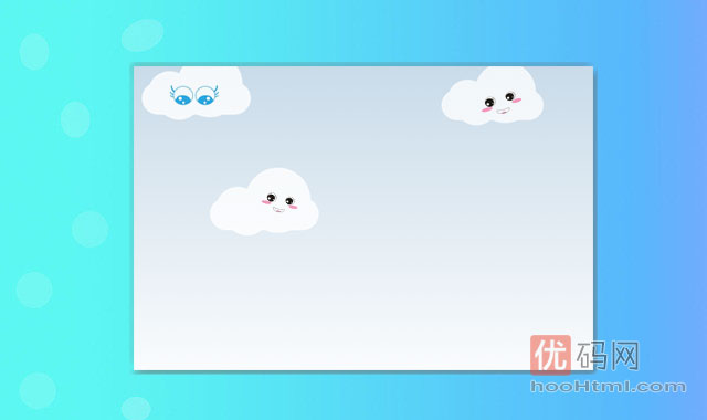
纯CSS3实现云朵飘动效果,展示一个简单的天空与周围的动画云彩。
HTML代码
	<!--
	So we will have an animated background with 5 clouds moving across the screen.
	Steps:
	1. create the clouds
	2. Animate them to move across the screen
	3. Stylize the clouds(can be done as step #2 also)
	-->
	<div id="clouds">
		<div class="cloud x1"></div>
		<!-- Time for multiple clouds to dance around -->
		<div class="cloud x2"></div>
		<div class="cloud x3"></div>
		<div class="cloud x4"></div>
		<div class="cloud x5"></div>
	</div>
	<!-- Thats the markup! -->
	<!-- That looks cool. We are done!! -->
CSS代码
body {
	/*To hide the horizontal scroller appearing during the animation*/
	overflow: hidden;
}
/*白云使用.cloud 和它的:before和:after伪元素来制作。*/
#clouds{
	padding: 100px 0;
	background: #c9dbe9;
	background: -webkit-linear-gradient(top, #c9dbe9 0%, #fff 100%);
	background: -linear-gradient(top, #c9dbe9 0%, #fff 100%);
	background: -moz-linear-gradient(top, #c9dbe9 0%, #fff 100%);
}

/*Time to finalise the cloud shape*/
.cloud {
	width: 200px; height: 60px;
	background: #fff;

	border-radius: 200px;
	-moz-border-radius: 200px;
	-webkit-border-radius: 200px;

	position: relative;
}

.cloud:before, .cloud:after {
	content: '';
	position: absolute;
	background: #fff;
	width: 100px; height: 80px;
	position: absolute; top: -15px; left: 10px;

	border-radius: 100px;
	-moz-border-radius: 100px;
	-webkit-border-radius: 100px;

	-webkit-transform: rotate(30deg);
	transform: rotate(30deg);
	-moz-transform: rotate(30deg);
}

.cloud:after {
	width: 120px; height: 120px;
	top: -55px; left: auto; right: 15px;
}

/*每一朵白云都执行moveclouds动画,但是它们的动画速度各不相同。大小和透明度也各不相同。*/
.x1 {
	-webkit-animation: moveclouds 15s linear infinite;
	-moz-animation: moveclouds 15s linear infinite;
	-o-animation: moveclouds 15s linear infinite;
}

/*variable speed, opacity, and position of clouds for realistic effect*/
.x2 {
	left: 200px;

	-webkit-transform: scale(0.6);
	-moz-transform: scale(0.6);
	transform: scale(0.6);
	opacity: 0.6; /*opacity proportional to the size*/

	/*Speed will also be proportional to the size and opacity*/
	/*More the speed. Less the time in 's' = seconds*/
	-webkit-animation: moveclouds 25s linear infinite;
	-moz-animation: moveclouds 25s linear infinite;
	-o-animation: moveclouds 25s linear infinite;
}

.x3 {
	left: -250px; top: -200px;

	-webkit-transform: scale(0.8);
	-moz-transform: scale(0.8);
	transform: scale(0.8);
	opacity: 0.8; /*opacity proportional to the size*/

	-webkit-animation: moveclouds 20s linear infinite;
	-moz-animation: moveclouds 20s linear infinite;
	-o-animation: moveclouds 20s linear infinite;
}

.x4 {
	left: 470px; top: -250px;

	-webkit-transform: scale(0.75);
	-moz-transform: scale(0.75);
	transform: scale(0.75);
	opacity: 0.75; /*opacity proportional to the size*/

	-webkit-animation: moveclouds 18s linear infinite;
	-moz-animation: moveclouds 18s linear infinite;
	-o-animation: moveclouds 18s linear infinite;
}

.x5 {
	left: -150px; top: -150px;

	-webkit-transform: scale(0.8);
	-moz-transform: scale(0.8);
	transform: scale(0.8);
	opacity: 0.8; /*opacity proportional to the size*/

	-webkit-animation: moveclouds 20s linear infinite;
	-moz-animation: moveclouds 20s linear infinite;
	-o-animation: moveclouds 20s linear infinite;
}

@-webkit-keyframes moveclouds {
	0% {margin-left: 1000px;}
	100% {margin-left: -1000px;}
}
@-moz-keyframes moveclouds {
	0% {margin-left: 1000px;}
	100% {margin-left: -1000px;}
}
@-o-keyframes moveclouds {
	0% {margin-left: 1000px;}
	100% {margin-left: -1000px;}
}
1. 本站所有资源来源于网络和用户上传!如有侵权请邮件联系客服!sys(at)hoohtml.com
2. 本站不保证所提供下载的资源的准确性、安全性和完整性,资源仅供下载学习之用!
3. 本由本站提供的程序对您的网站或计算机造成严重后果的本站概不负责。